
I will start this article by saying that I totally agree with Peter Drucker’s quote “If you can’t measure it, you can’t improve it”.
As an adaptive process, an agile project should always seek to improve its performance and efficiency and that’s why we need to track its performance.
When it comes to monitoring and controlling agile projects, there is always a big discussion about how far we should implement controls and performance metrics without impacting the team’s self-organization and autonomy.
Tracking an agile project is a challenge because we can add new features any time.
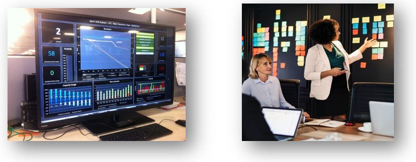
Information radiators
The best way to visualize the progress of an agile project is through an Information radiator.
Information radiator refers to any form of handwritten, drawn, printed or electronic communication placed in a highly visible location, so that all team members and any other stakeholder could quickly see information regarding the progress of the project.
i.e. a big monitor, a big physical paper chart, etc
Once the means of communication has been defined, let’s take a look at 05 ways to track your agile project.
Burn-down chart
This graph shows the amount of work remaining over time. It is very useful to predict when all the work will be completed.
The vertical axis shows the number of story points remaining over time. The horizontal axis represents time (days, weeks, iterations)
The faster the line of actual performance decreases, the better the performance.
You can have a second line showing a uniform distribution of the work or a forecast for the end of the project (keeping the actual scenario)
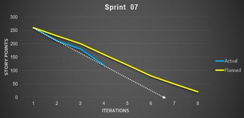
In this example, the initial estimate of the project based on the team’s performance is that it will be completed in sprint 8
But, observing the trend of the work done, we can estimate that the project will end before sprint 07.
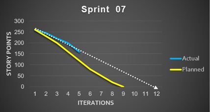
Behind the schedule
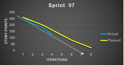
Ahead of schedule
If your trend is above the planned, your project is behind the schedule. If the trend is below the planned, you are ahead of the time.
Burn-down bar chart
This graph represents both the items we have done and the changes in the sprint backlog
Each bar in the burn-down chart shows the amount of work as of the start of an iteration.
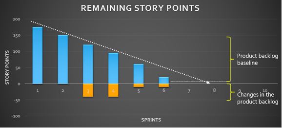
This type of burn-down chart uses bars rather than lines to help distinguish the regions above and below the horizontal axis at 0.
The bottom of the bar is lowered whenever work is added to the project.
The bottom is moved up whenever work is removed from an iteration. If the bottom is below the horizontal axis at 0, it means that overall work has been added.
There are four simple rules to keep in mind when drawing this type of burn-down chart.
- Any time work is completed; the top is lowered.
- When work is re-estimated; the top moves up or down.
- When new work is added; the bottom is lowered.
- When work is removed; the bottom is raised.
A couple of warnings on using Burn-Down Bar Chart.
First, the Burn-Down bar chart is harder to understand, so I almost always start a new team with the simpler Burn-Down line chart.
Second, the Burn-Down bar chart is for use only in organizations mature enough not to argue about whether something belongs above or below the line.
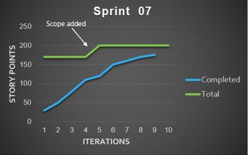
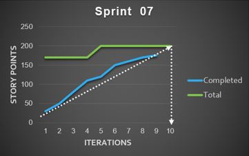
Burn-up chart
A Burn-up Chart is a variation of the burn-down. In this case, used to track how much work has been completed and show the total amount of work for a project or iteration.
One of the advantages of a Burn up chart over a Burn down is the inclusion of the scope line. It clearly tracks when work has been added or removed from the project.
A Burn-up chart shows the work completed in relation to the total scope of the project. When the two lines meet, it means that the project is completed.
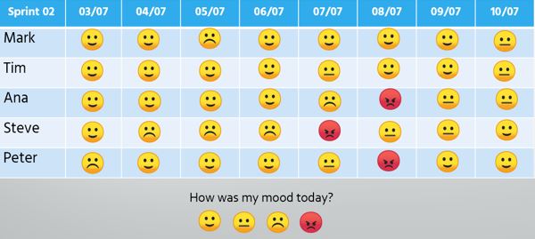
Niko-niko chart
This chart (actually a calendar) allows each member to show their mood at the beginning our end of a working day.
The Niko-niko calendar is a great opportunity for reflection especially when we make changes to the project or are affected by an external event. It is also useful for identifying team members who are unhappy or have personal problems.
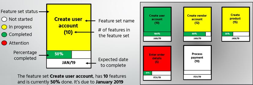
Parking lot chart
This diagram was initially used in Feature Driven Development (FDD) projects, but it can also be used in scrum projects.
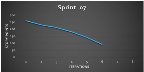
Small and medium-sized projects containing up to a few hundred resources can be easily managed with post-its, task boards and detailed graphics. However, as projects are scaled, it becomes more difficult to manage all this information and communicate properly to all stakeholders.
Parking lot diagrams group resources and requirements into functional groups and then those groups into functional areas to better illustrate overall progress in relation to business areas.
You have a lot of information here.
A parking-lot chart contains a large rectangular box for each theme (or grouping of User Stories) in a release.
Initially you identify the main box with the Feature set name. The main box also contains a percent complete figure based upon the combined status of each of the (10) features within it.
You can report the Feature set status by color as it became in progress, completed or require attention.
The bottom portion of the box contains a progress bar that duplicates the percent complete figure to give a more visual measure of this number and the target completion month for this group of features
I hope you can use one or many of these resources to monitor and control your projects.
Did you like it?
share it Didn’t you like it?
comment or leave your thoughts to improve it

Download your FREE ebook 'HOW TO BE A GOOD PROJECT MANAGER'
Best advices from 30 TOP influencers in project management